
If you're running Meta Ads in 2026 and sending traffic to your homepage, you are burning ad spend. Period.
Your homepage has a navigation menu, ten different links, an "about us" section, and a footer. It is built for exploration. But when someone clicks an ad, exploration is the enemy. You paid for that click to get one specific action: a lead, a purchase, or a booking.
A dedicated landing page has one job: convert paid traffic into that single action. This guide is the exact blueprint we use on high-spending accounts. The free file below builds the whole page for you with AI in minutes.
Free download · No email required
The 500-line landing page spec
Open Claude Code, Cursor, or Google Antigravity, feed it this file, and say "Build my landing page based on these instructions." It writes the full page for you.
Download the prompt file (.md)The 3 Pillars of a High-Converting Landing Page
Before you build, you need to understand the three non-negotiable rules of Meta Ads traffic.
1. Message Match
Message match is the single biggest lever on quality and conversion. The visitor formed an expectation from the ad. The page must pay it off immediately. The hero headline must restate the ad's core promise, ideally reusing the key phrase verbatim. If your ad promises a "Free AI Marketing Guide", the landing page header better say exactly that, not just "Welcome to Our Agency".
2. The 1:1 Attention Ratio
Remove the navigation menu. No top nav links, no menu, no footer link farm. Every exit that is not the Call To Action (CTA) is a leak. Keep only the logo (not linked, or linked to the same page top), the CTA, and legally required footer links.
3. Millisecond Load Speeds
Roughly 80 to 90 percent of Meta traffic is on mobile. If your page takes more than 2.5 seconds to render the largest above-fold element (LCP), you've already lost them. Optimise your images, defer non-critical Javascript, and use a fast framework.
The Anatomy of the Page
Here is how you actually structure the page, section by section. This is the exact blueprint we use for high-spending accounts.
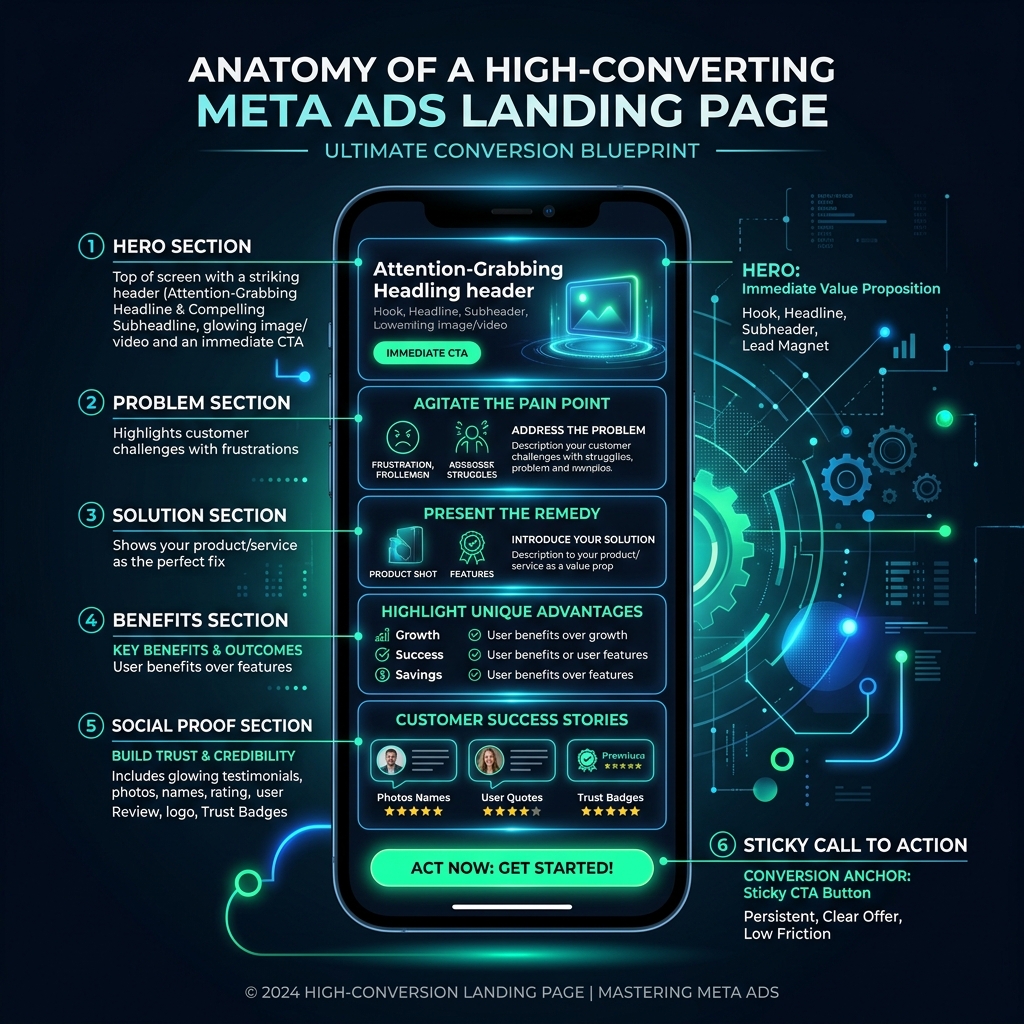
The Hero Section (Above the Fold)
The most important real estate on the page. Without scrolling, the user must see a headline (the main benefit), a subheadline (clarification or objection handling), a primary CTA button, a hero visual, and a small trust strip (like a star rating or logos).
Problem & Agitation
Name the pain the visitor feels in their own words. Make them nod. Short. This section earns the right to present the solution.
Social Proof is Mandatory
The trust engine of the page. Place it near every decision point, not just once. Use customer testimonials with real names and specific results. "Cut our reporting time from 6 hours to 20 minutes" outperforms "Great product, highly recommend."
The Sticky Mobile CTA
On mobile, use a sticky CTA bar so the action is one tap away at any scroll position. Tap targets must be at least 48 by 48 pixels with comfortable padding.
Build it Instantly with AI
We've open-sourced our internal 500-line markdown specification for landing pages. You don't need to code this manually.
How to use it: Download the file below. Open Claude Code, Cursor, or Google Antigravity. Feed it the file and say "Build my landing page based on these instructions."
Download the .md Prompt FileWhat Not To Do (The Anti-Patterns)
- Do not ask for more form fields than you absolutely need. Name, Email, Phone. That's it.
- Do not use generic stock photos. Use real people, your product, or real results.
- Do not fire your Meta Pixel before consent in regions that require it.
- Do not hide the CTA at the very bottom. It needs to be in the hero, mid-page, and final section.
Stop guessing what works. Use the blueprint, let AI write the code, and start converting your traffic today.
Get the free landing page spec
The same 500-line markdown file we feed our own AI tools. Download it, hand it to Claude Code or Cursor, and ship a converting landing page today.
Download the prompt file (.md)